Interface builder and autolayout are arguably among the most useful features of Xcode. But with such a range of device sizes available, basic constraints don’t always cut it.
In this post, we’ll walk through a thought process of utilising auto layout constraint priorities to create an app that looks great whatever the screen size. Check out the example project here and run on a large screen device or simulator to see the effect of priorities on auto layout constraints in action.
Scenario
You are to develop a splash screen for a new app consisting of the main app logo in the centre with the two smaller logos in the bottom left and bottom right corners respectively. The design team have requested a 32 point margin between:
- The left logo and the left of the screen
- The right logo and the right of the screen
- The left and right logos with the bottom of the screen
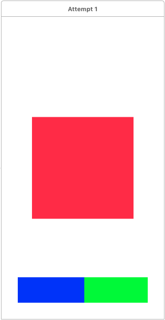
Attempt 1
You set up:
- Centre x and centre y constraints on the centre logo
- Leading and bottom constraints on the left logo
- Trailing and bottom constraints on the right logo
- Width and height constraints on each logo
On a large screen your design looks great:

But then you decide to see how it looks on a narrower screen:
Uh oh! The bottom left and bottom right logos overlap! Back to the drawing board…
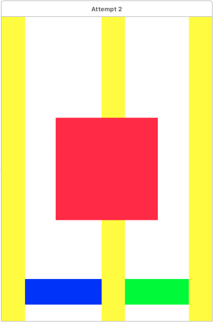
Attempt 2
To ensure that the left and right logos don’t overlap, you decide to introduce spacer views between them. You create three spacer views (coloured here for visibility) and apply the corresponding constraints:
- The first spacer view between the left of the screen and the left logo
- The second spacer view between the left and right logos
- The third spacer view between the right logo and the right of the screen
- Equal width constraints between the spacer views
Now let’s see how this looks on various screen sizes:
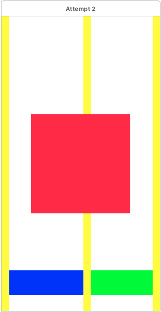
Hmm… not too bad... The design team are less impressed however and it looks like we’ve come as far as we can with basic constraints so now let’s take a look at priorities.
Attempt 3
You now decide that you want to try to maintain the 32 point logo-to-screen margins unless the two logos become too close (less than 32 point) together in which case you want the logo-to-screen margins to shrink. To start with you delete the centre spacer view, and then apply constraints for:
- The left spacer view has width equal to 32
- The left spacer view has equal width to the right spacer view
- Horizontal spacing of greater than or equal to 32 between the logos
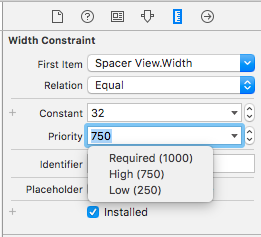
Depending on the width of the screen and of the logos, interface builder may be happy with this or may complain with auto layout errors. To enable this layout to work on a range of screen widths, reduce the priority of the left spacer view width from required (1000) to high (750).
So now:
- On a wide enough screen, the two logos will be 32 points away from their respective screen edges
- As the screen becomes narrower, the two logos will continue to be 32 points away from their respective screen edges and the distance between the logos will shrink
- When the distance between the two logos would otherwise fall below 32 points, the left spacer view width (equal to the right spacer view width) constraint breaks as it has the lower priority
- The logos now become closer to their respective screen edges whilst maintaining the distance between them
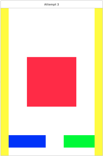
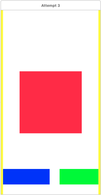
So now the spacings are correct on a sufficiently wide screen but it still doesn’t look right on a narrower screen…
Attempt 4
You still would like to maintain the 32 point logo-to-screen margins and the logo-logo spacing to be at least 32 point but this time when the screen becomes too narrow you want all margins to shrink. Remove all width constraints from the spacer views, put back the centre spacer view, and add constraints for:
- The left spacer view has width less than or equal to 32
- The left and right spacer views have equal widths
- The left and centre spacer views have equal widths but with reduced priority (750)
With these new constraints:
- On sufficiently wide screens, the left and centre spacer views equal widths constraint is broken with the left and right spacer views both having width 32 and the centre spacer view filling the remaining space
- As the screen becomes narrower, the centre spacer view shrinks until it matches the width of the left (and therefore right) spacer view at which point the constraint is reactivated
- After this point all three spacer views shrink at the same rate
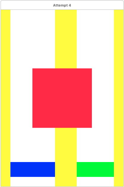

Again, the spacings are correct on a sufficiently wide screen and look a little better on a narrower screen, but maybe we could do better by adjusting the size of the logos too…
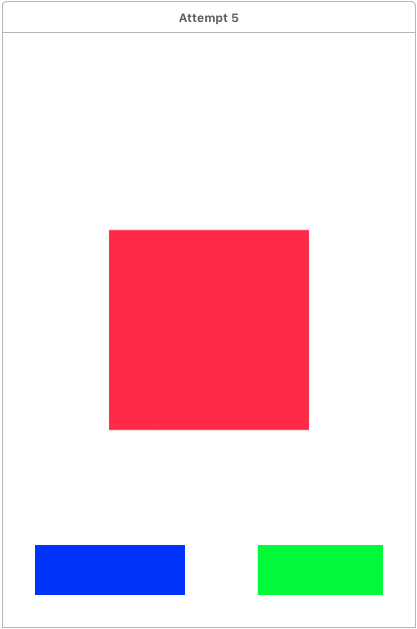
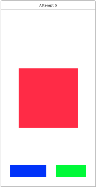
Attempt 5
You now want to force the logo-to-screen margins to always be 32 point and maintain a minimum logo-logo spacing of 32 point but to compensate for a narrow screen width, instead the logos are to shrink. To start with:
- Delete the left and right spacer views and replace with 32 fixed constraints between the logos and their respective screen edges
- Delete the centre spacer view and replace with a horizontal spacing constraint of greater than or equal to 32 between the logos
Then:
- Remove the height constraint of each logo (keeping the width constraint) and replace with an aspect ratio constraint
- Reduce the priority of the width constraint of each logo (750)
This may seem to be enough to do what we are after, but on a narrow screen you’ll be presented with auto layout errors. But why? Although auto layout understands that it should shrink the width of the logos, it doesn’t know how to shrink them because they have equal priorities. If you were to change the priority of one width constraint to 751 then autolayout would know to shrink the other one. But how to make them both shrink?
- Add a less than or equal to width constraint to the left logo
- Remove the width constraint from the right logo
- Add an equal widths constraint between the two logos
Conclusion
From here, the next step could be to extend attempt 5 to restrict how much the logos are allowed to shrink and then the margins would change width to compensate but that can be left as an exercise to the reader. Priorities are a useful feature of auto layout constraints and it takes careful thought (or trial and error!) to get them right. Don’t forget to check out the example project and run on a large screen device or simulator which demonstrates these examples.